My love for the written word and my passion for design, have, quite logically, translated into a fascination with typography. The following is a series of explorations that look at how the visual aspect of typography interacts with the textual aspect to creative new meanings and meta-narratives.
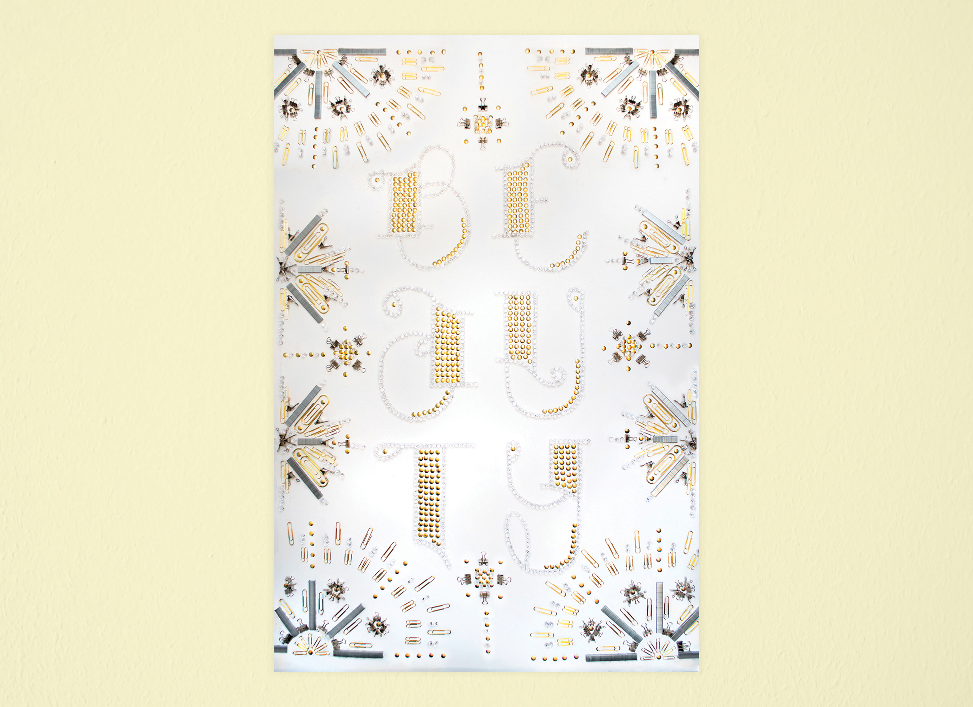
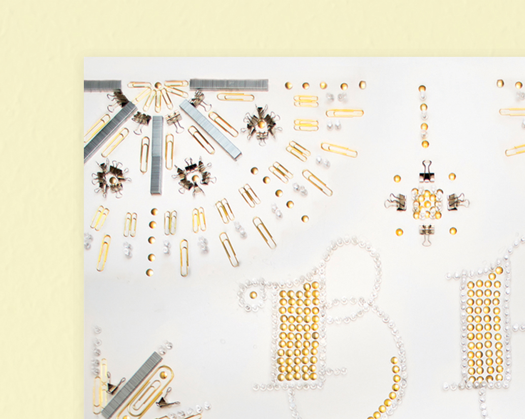
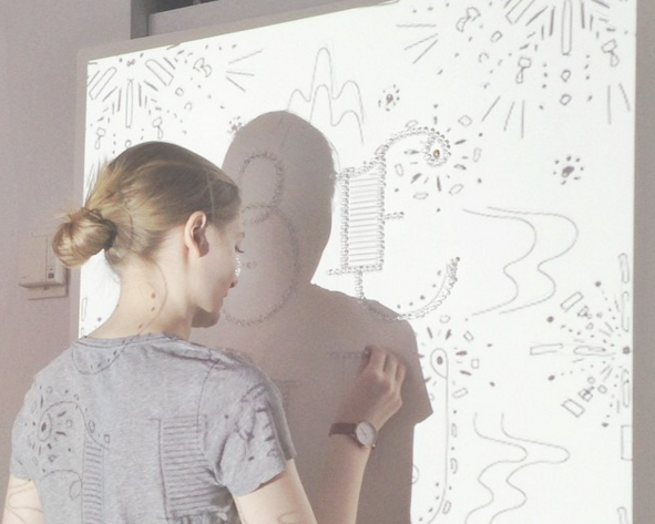
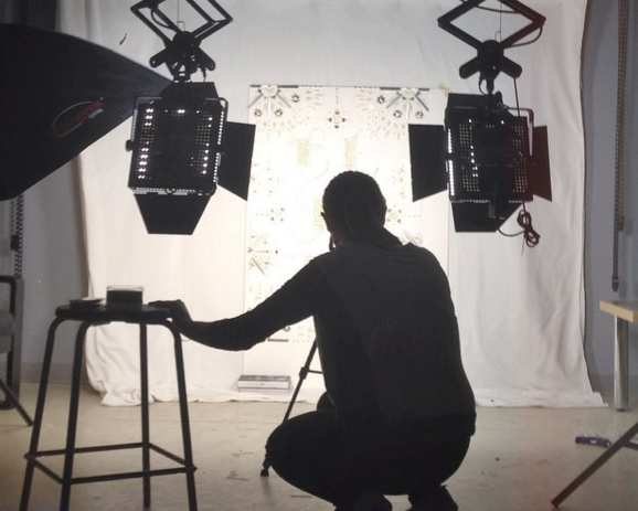
Constructed from hundreds of paper clips, push pins, bull clips and staples, this 24” x 36” poster explores the potential for beauty to be found in mundane, everyday objects.
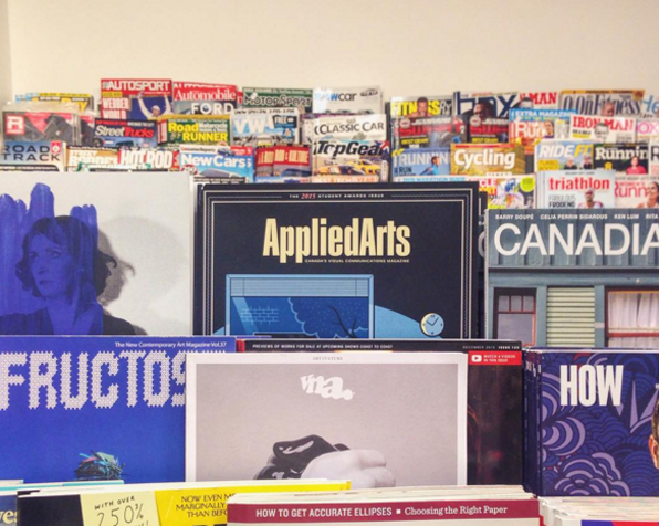
In November 2015, this piece was exhibited at Swash & Serif 2, a one-week long typography show at the Black Cat Gallery in Toronto, Ontario. "Beauty" was also selected as a winner in the 2015 Applied Arts Student Awards. The piece was published in the magazine in November 2015 and distributed globally.

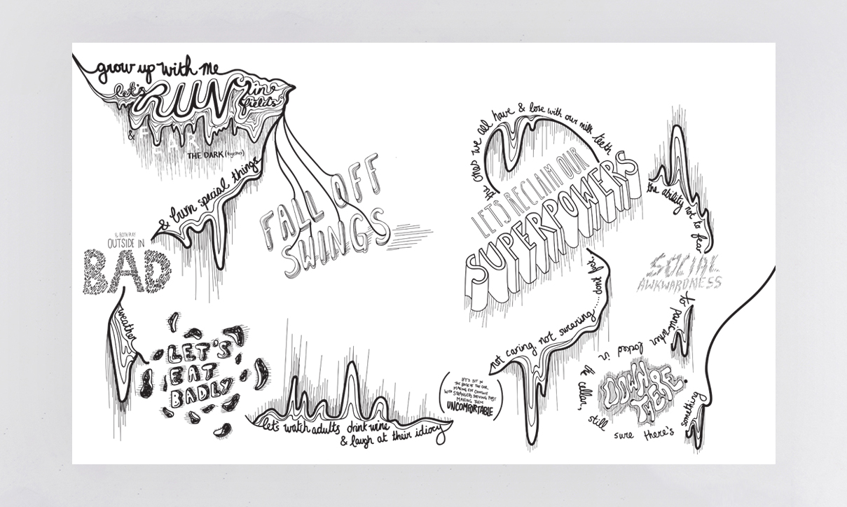
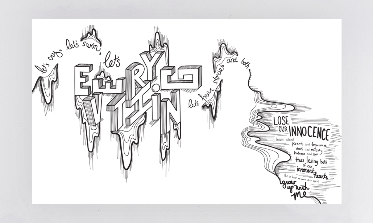
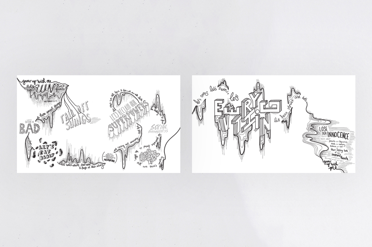
A typographic rendering of a poem called Grow Up With Me by Keaton Henson. The primitive illustration style and meandering composition in this diptych embody Henson's nostalgic wish for the wonder and simplicity of childhood.
An exercise in expressive typography whereby several existing typefaces were combined with illustrative details to construct custom letterforms.
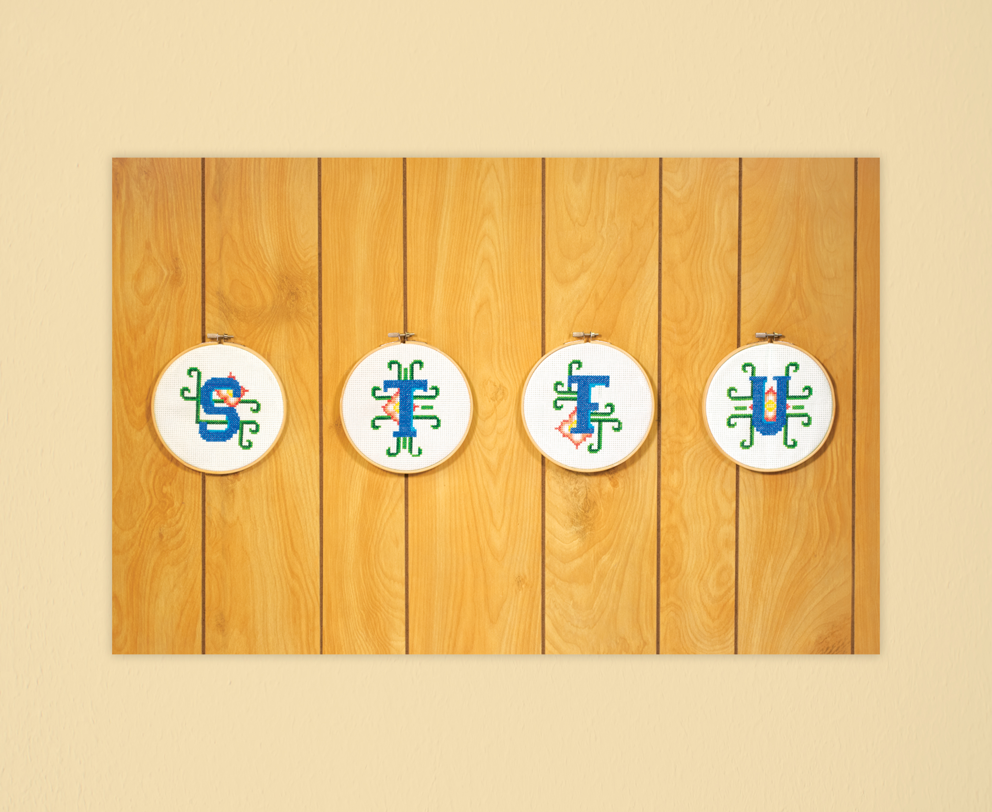
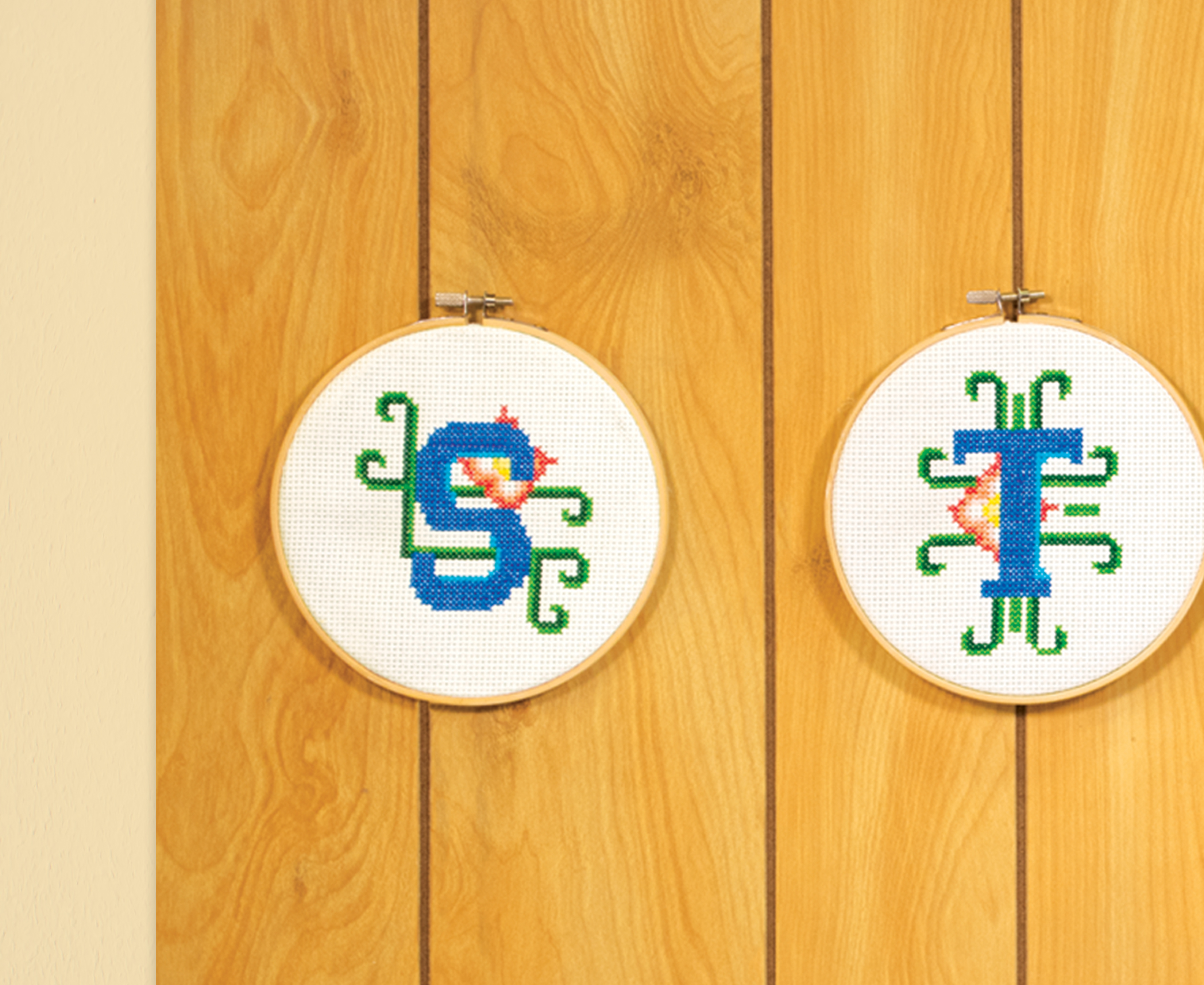
An playful juxtaposition of contemporary, rapid-fire internet slang and painstakingly meticulous retro handicrafts. The pattern for each letterform was custom designed and then cross-stitched by hand.
In November 2015, this piece was exhibited at Swash & Serif 2, a one-week long typography show at the Black Cat Gallery in Toronto, Ontario.